Contents
Meaning of Demand Curve
The demand curve shows the demand for a commodity at varying prices at a given time. Putting alternatively, the demand curve is the graphical presentation of the demand schedule. Thus the graphical representation of the demand schedule showing the relationship between the price of a commodity and its demand is a demand curve. The demand curve can be of two types as individual demand and market demand curve.
Individual Demand Curve (IDC)
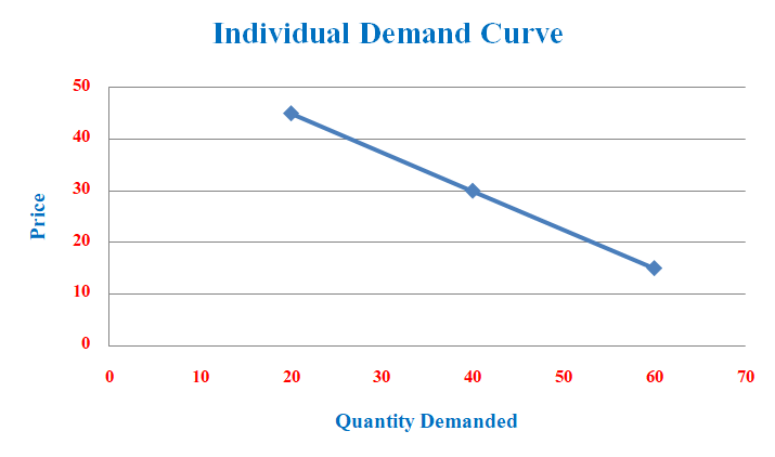
A curve that shows various quantities of demand for a commodity by a consumer or by a particular household at various prices is known as the individual demand curve. It is the graphical illustration of a person or individual demand schedule. The following table shows the individual demand schedule and the corresponding graph shows the individual demand curve.
| Price of Apples (in Rs.) | Quantity Demand (in kg) |
| 20 | 45 |
| 40 | 30 |
| 60 | 15 |
The graphical representation of the above demand schedule gives the individual demand curve.

In the above figure, quantity demand is measured on the X-axis, and the price of the apple is determined on Y-axis. The downward-sloping curve is an individual demand curve showing different combinations between the price of an apple and the quantity demand for apples made by a household. It is downward sloping because of the indirect or inverse relationship between price and quantity demand.
Market Demand Curve (MDC)
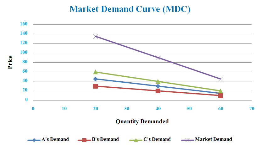
The aggregate of the demand of all the potential consumers for a specific good over a given time is known as market demand. Thus, the market demand curve shows the relationship between various quantities of demand for a commodity and the different prices of the product. The market demand curve can be derived with the help of a market demand schedule. The following table and the corresponding graph show the market demand schedule and market demand curve respectively.
| Price of Apples (in Rs.) | Demand by A | Demand by B | Demand by C | Market Demand (A+B+C) |
| 20 | 45 | 30 | 60 | 135 |
| 40 | 30 | 20 | 40 | 90 |
| 60 | 15 | 10 | 20 | 45 |
The graphical illustration of the above market demand schedule gives us a market demand curve.

In the figure, there are four different downward-sloping demand curves. The initial three curves are individual demand curves of households A, B, and C and the remaining one is the market demand curve. The market demand curve is derived from the lateral summation of these individual demand curves. It shows the range of demand quantities for a product demanded by entire buyers in the whole market.
Thus the demand curve shows the graphical illustration of the demand preference of individuals as well as the market. The summation of personal preferences will give us a market preference at different prices.
Difference between Individual and Market Demand Curve
The individual and market demand curves both represent a similar type of relationship between the price of a commodity and demand for that commodity. Both are also slopping downward from right to left indicating a negative relation between prices and demand. However, these two curves are fundamentally different from each other. The following points show these major differences between individual and market demand curve;
- IDCs are nearer to origin but MDC is farther from the origin.
- Individual demand curves are individualistic but the market demand curve is the horizontal summation or aggregate of all the individual demand curves.
- The individual demand curve shows the small quantity of demand for a commodity but the market demand curve shows a large volume of quantity demand made by the entire consumer in the market.
Therefore, every individual demand curve in an aggregate form generates a market demand curve. Since all the demand curves exhibit an inverse relationship between price and demand thus is downward sloping.